Visualising Eighteenth-century Poetic Cultures
Over the last few months, I’ve been working with Dr Jennifer Batt on a project entitled ‘Visualising the poetic cultures of eighteenth-century periodicals’. Jenny’s research interests include studying poems that were published in newspapers and magazines during the eighteenth-century – a corpus that has been largely ignored by scholars, mainly because it has been seen as ‘trite or sentimental “filler” worth no one’s time’ (quote from Linda K. Hughes, ‘What the Wellesley Index Left Out: Why Poetry Matters to Periodical Studies’, Victorian Periodicals Review). In fact, Jenny’s article, ‘Poems in Magazines’ in The Oxford Handbook of British Poetry, 1660–1700 provides a good introduction and ‘sketch map of a vast, and largely unexplored, literary terrain’.
Since the publication of the article in 2016, Jenny has created a dataset of metadata for c. 10,000 published poems in 22 newspapers or magazines. The data includes publication details (publication, publication format, date), details about the author (if known) and first line, second line, penultimate and last line of the poem. This is an impressive endeavour, but much more data collection and investigation are needed. In this regard, Jenny was awarded a pump-priming project funded by the British Academy / Leverhulme Small Research Grants scheme to analyse the data collected to date and create visualisations that help to formulate further research questions for future projects that will allow further data collection.
As the Research Software Engineer (RSE) on the project, it has been a privilege to work with Jenny, her dataset and to collaborate with two other colleagues at the University of Bristol. Namely, Natalie Thurlby, a data scientist in the Jean Golding Institute ; and Chris Edsall, a RSE in the Advanced Computing Research Centre.
We opted to use Jupyter Notebooks to provide a working environment where Jenny could run and rerun visualisations. We would use pandas for querying and analysing Jenny’s data, and the Matplotlib and Seaborn libraries for creating plots. Initially, I thought we could use a cloud-based hosted service, such as Microsoft Azure Notebooks. However, this wasn’t practical for several reasons. In the case of Azure the default pandas library version is quite old and the suggested solution of using conda to update it is very slow, especially when an Azure instance will shut down after a relatively short period of inactivity. We therefore opted to use Anaconda – ‘The World’s Most Popular Python/R Data Science Platform’ – to allow Jenny to run Jupyter Notebooks on her PC.
I created several different visualisations that ranged from broad overviews of the data, to specific ones around authorship and gender, with the ability to drill-down into the data. This post includes a few examples of the plots created for the project to give a taster of the work being used to construct additional research questions.
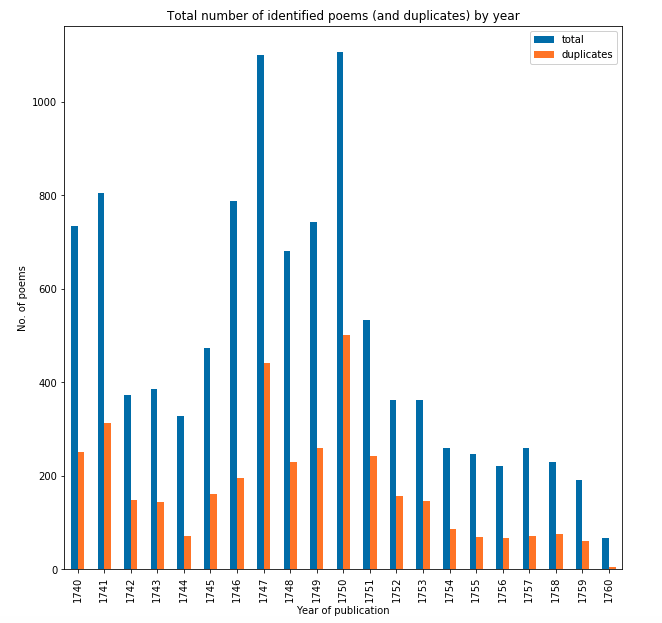
The following graph shows the total number of poems published each year in our dataset (blue) against the number identified as copies (orange) i.e. published more than once.
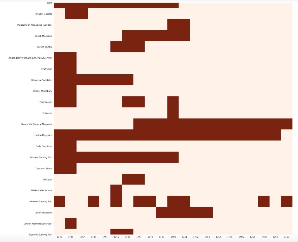
The following heat map shows the coverage of our dataset, which highlights that we are dealing with an incomplete landscape. Red indicates that we have data for a publication for a certain year, while the cream highlights we have gaps. That said, we do need a third colour since some publications had a very short print run and therefore our data might be complete for them.
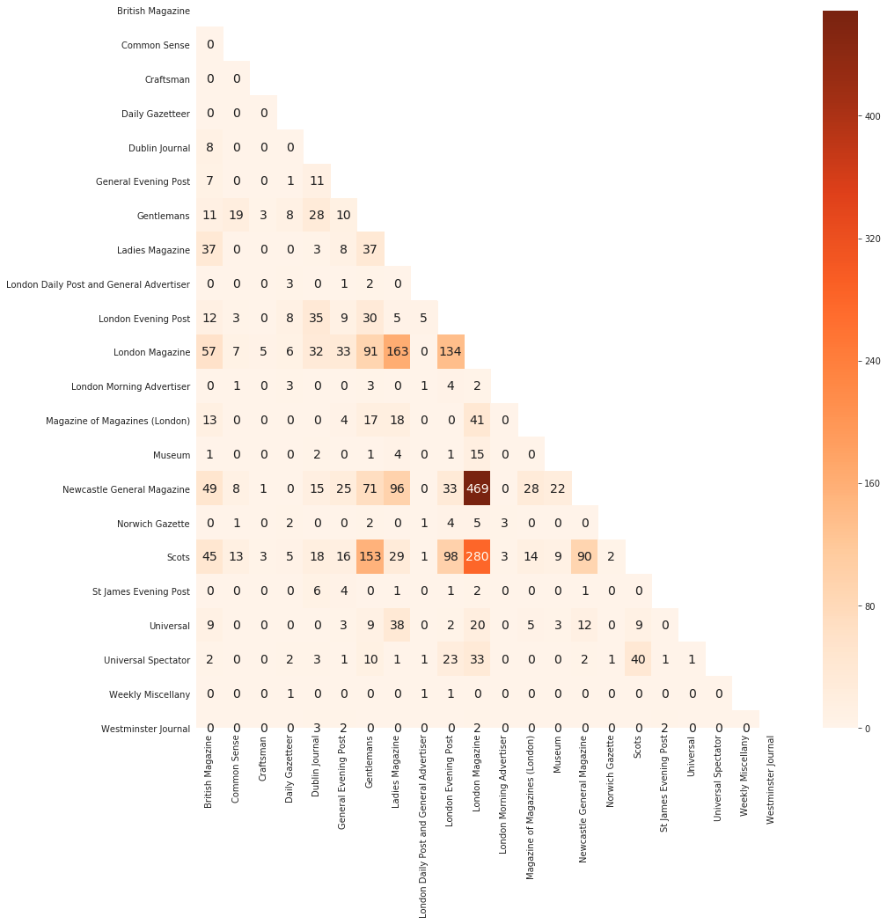
The following heat map shows where poems are shared between publications. We can quickly identify that a large number of poems were shared between London Magazine and both Newcastle General Magazine and Scots.
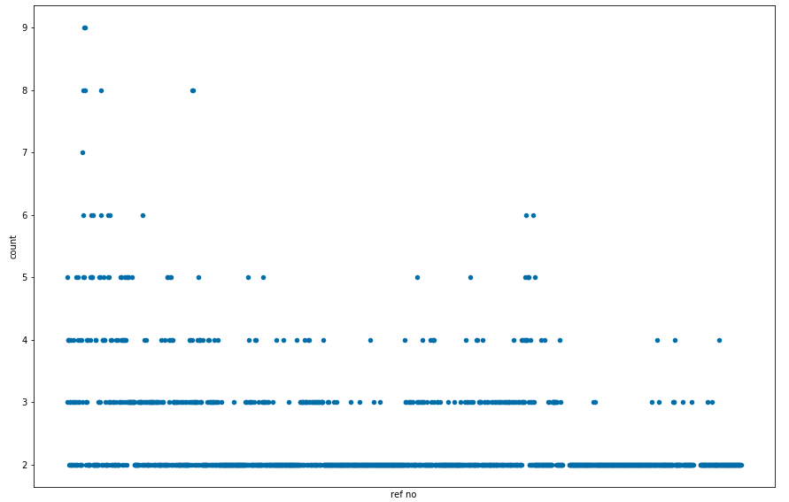
With regards to ‘copies’, we can see that the vast majority were only published twice, leading to some outliers that were published eight or nine times. This pattern might change when we get more data.
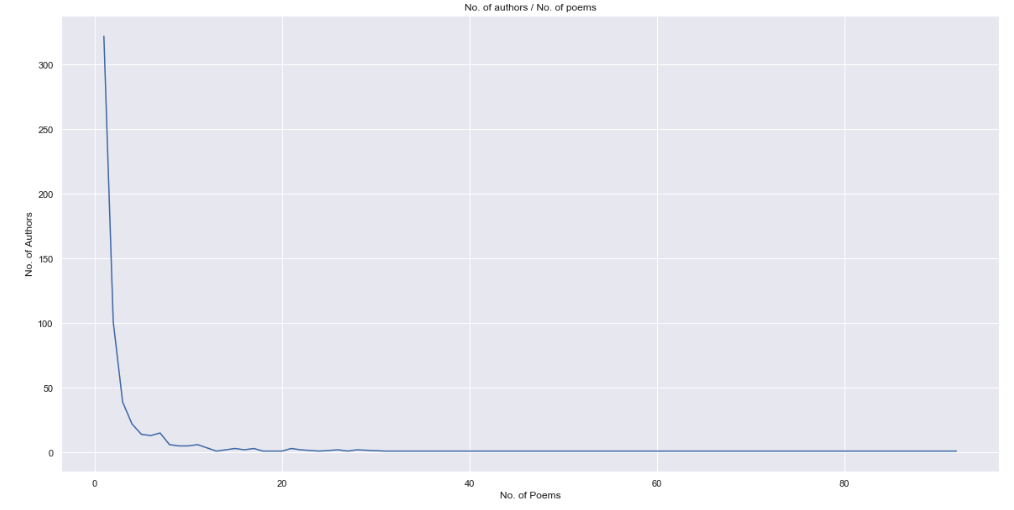
With regard to attributed authors (lots were published anonymously) we can see in our dataset that a large number of authors only appear once with a long tail of a small number of authors who were published many times.
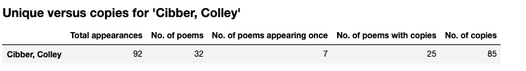
In our dataset Colley Cibber (actor, playwright and Poet Laureate) is the most published. Mainly, because as Poet Laureate, he was commissioned to write two poems a year – one for the New Year, and one for the King’s Birthday – and these were widely printed in the newspapers.
The discovery of copies was originally provided by some earlier input from the Jean Golding Institute, who provided a ‘matching’ algorithm. This process took several hours, but by replacing it with the ‘tone-deaf’ named FuzzyWuzzy library we reduced the processing time to around ten minutes. Chris thinks the processing time can be reduced much further if we replace fuzzy string matching with something like cosine similarity. In a future project, I’d also like us to explore creating a workflow with parallelized code that runs on the High Performance Computing facilities that we have at Bristol.
Jenny is working with the visualisations to explore her existing dataset and to formulate more research questions, with the hope of obtaining further funding to expand the dataset to give a more comprehensive picture of this neglected poetry.